Project Brief
The magazine is meant for people who need a quick and easy laugh in between their busy schedules.
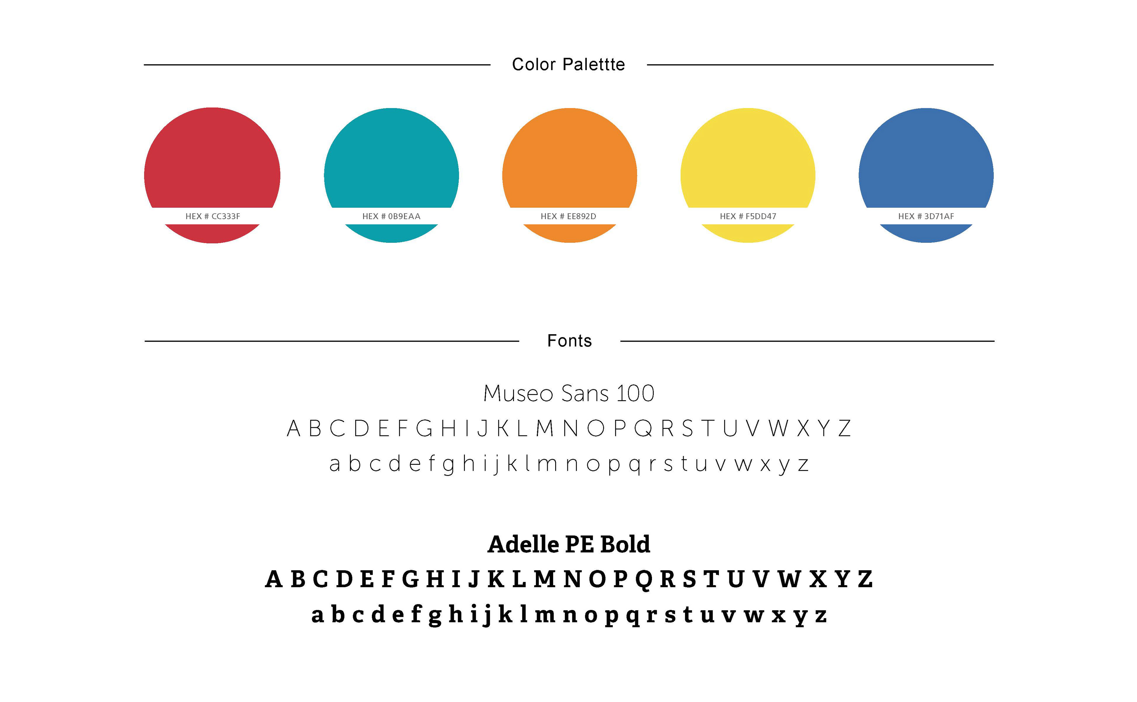
Style Guide
I wanted the magazine to be full of funny content and have the design compliment the hilarity. I felt color, typography, and content were the best way to accomplish the quriky look.
Process
MAD Magazine's hilarious look and images were a huge influence on how I wanted people to feel reading my magazine, as well as Vanity Fair’s Bill Murray issue because they were effective in using the design to compliment Murray’s jokes. I used their influence and bright colors to reflect a funny atmosphere.